

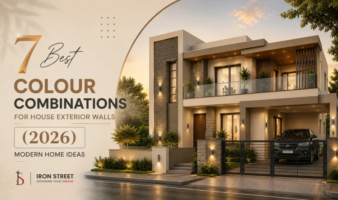
7 Best Colour Combinations for House Exterior Walls (2026) – Modern Home Ideas
| May 26, 2026Your home’s exterior is the first thing people notice. Before anyone steps inside, the outside wall colors already create an impression about your home’s style, personality, and overall appearance. Whether you own a modern duplex, a traditional independent house, or a luxury villa, choosing the right color combinations for house exterior walls plays a huge role in enhancing curb appeal.
In 2026, exterior house color trends are shifting toward modern color combinations that create depth, contrast, and a premium architectural look. Homeowners are now moving away from outdated single-tone paints and choosing stylish exterior wall color combinations that make their homes look more elegant, spacious, and visually attractive.
Why Exterior Color Combinations Matter in Modern Homes:
When we think about home design, we often focus internally on modular kitchens, living room layouts, and interior accents. But the exterior walls do the heavy lifting when it comes to long-term value and visual impact.
First Impression and Curb Appeal:
Curb appeal is essentially the financial value of a stellar first impression. A thoughtful combination of exterior house paint colors can completely redefine the perceived architecture of your home. It can make a compact home look grander, a tall building look balanced, and a standard concrete structure look premium. If you ever intend to sell or rent your property, an attractive exterior color palette can significantly increase its value.
Weather Resistance and Maintenance Factors:
The color palette you choose directly impacts how well your walls hide this wear and tear. For instance, while pure white looks beautiful in architectural renders, it can quickly turn into a patchy, yellowish-grey mess after a single monsoon season if not selected or maintained properly. Darker shades absorb heat, which can raise indoor temperatures, while specific mid-tones camouflage dust exceptionally well.
Importance of Choosing the Right Paint:
Choosing the right outside paint colors for a house isn’t just an aesthetic choice; it’s a protective strategy. The right colors accentuate architectural trim, hide design flaws, and create visual harmony with your roof, boundary walls, and surrounding environment.
7 Best Colour Combinations for House Exterior Walls (2026)
Here are the top 7 curated, designer-approved color combinations for house exterior walls that are dominating modern architecture in 2026.
1. Warm White & Charcoal Grey
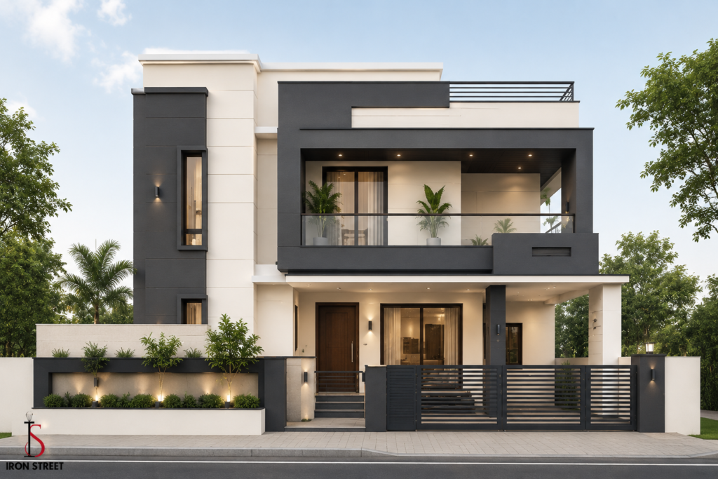
This combination is the undisputed champion of modern urban duplexes, villas, and contemporary apartments. By replacing stark, cold hospital white with a softer, underlying warm cream-white, you gain all the brightness of a light exterior without the clinical feel.
Pairing this soft white base with sharp, geometric charcoal grey panels creates an immediate, premium architectural look.
- Where to apply: Use warm white across 75% of the main concrete structure. Reserve charcoal grey for structural pillars, window frames, projection slabs, and recessed walls to create visual depth.
- Why it works in 2026: It delivers a high-end, clean European aesthetic while offering sharp, eye-catching structural contrast.
2. Beige & Coffee Brown
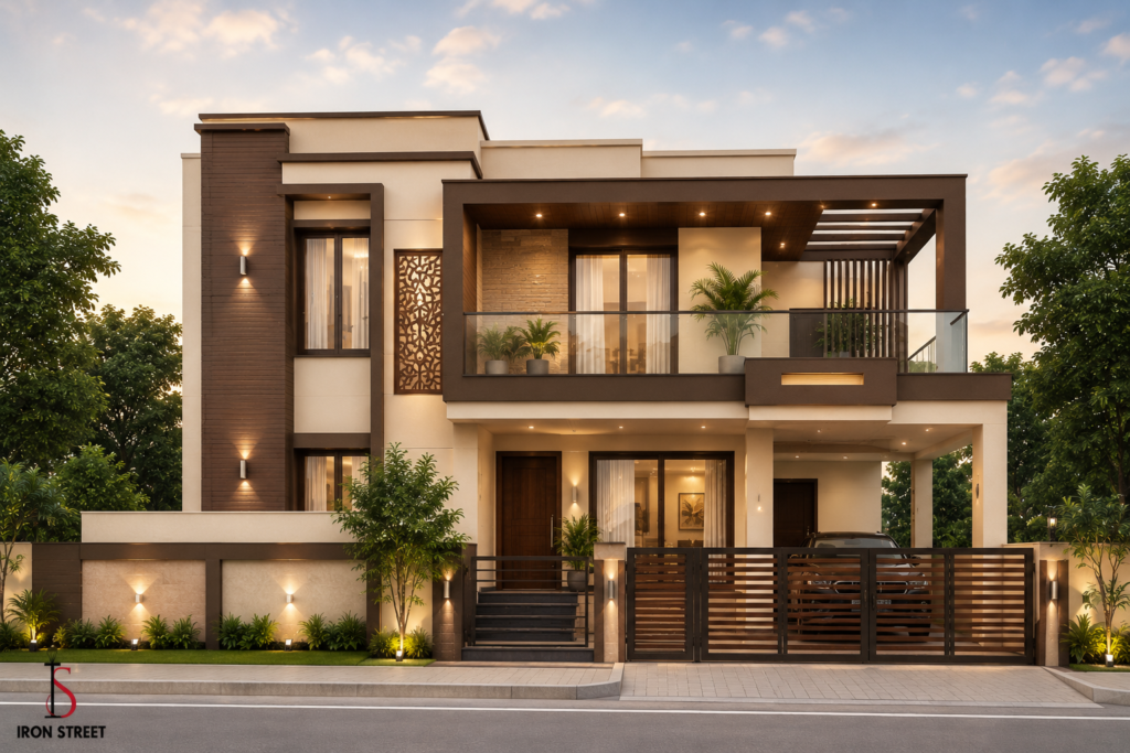
If your priority is a timeless look that requires minimal maintenance, beige and coffee brown is a phenomenal choices. This is an incredibly reliable color combination for Indian homes because of its outstanding ability to hide dust and weathering.
- Where to apply: Paint the primary expansive walls in a rich, creamy beige or biscuit tone. Use deep coffee brown or dark chocolate tones on structural beams, porch columns, rafters, and the boundary wall accents.
- Why it works in 2026: It strikes a perfect balance between warmth and formality, making homes feel inviting while hiding dirt in high-traffic or dusty neighborhoods.
3. Sage Green & Off-White
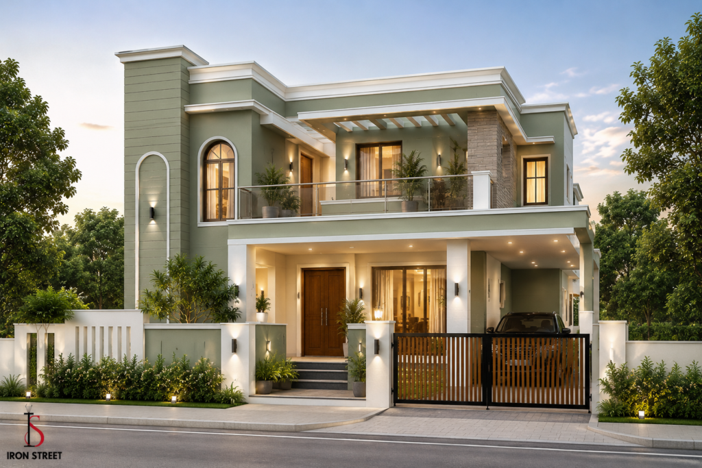
Nature-inspired palettes have exploded in popularity this year. Sage green is a muted, sophisticated green with grey undertones. It avoids looking overly bright or eccentric, instead offering a calm, organic, and highly premium exterior vibe.
- Where to apply: Perfect for independent houses, villas, and bungalow-style properties. Use sage green on the prominent focal walls or upper-level facades, and ground the look with off-white or ivory on the trim, compound walls, and porch ceilings.
- Why it works in 2026: It breaks away from standard neutrals, offering a serene, resort-style appearance that blends beautifully with front gardens and landscaping.
4. Terracotta & Cream
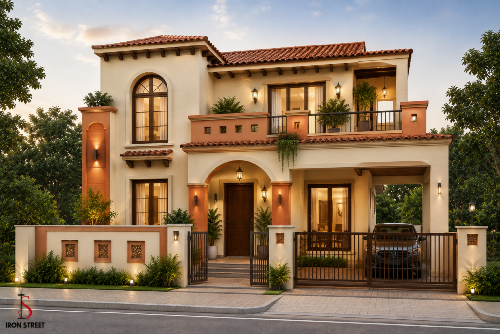
For homeowners who love traditional architectural roots but still want a fresh, updated look, terracotta and cream is a beautiful choice. Terracotta brings the raw, comforting texture of baked earth, which looks stunning under the golden evening sun.
- Where to apply: This works wonders on traditional or semi-modern homes with sloping roofs, stone columns, or exposed brickwork. Keep the primary walls in a warm cream to reflect sunlight and keep the home cool, then paint porch archways, parapet walls, or decorative accents in terracotta.
- Why it works in 2026: It celebrates local heritage while avoiding a dated look, turning any home into an elegant, culturally rich sanctuary.
5. Navy Blue & White
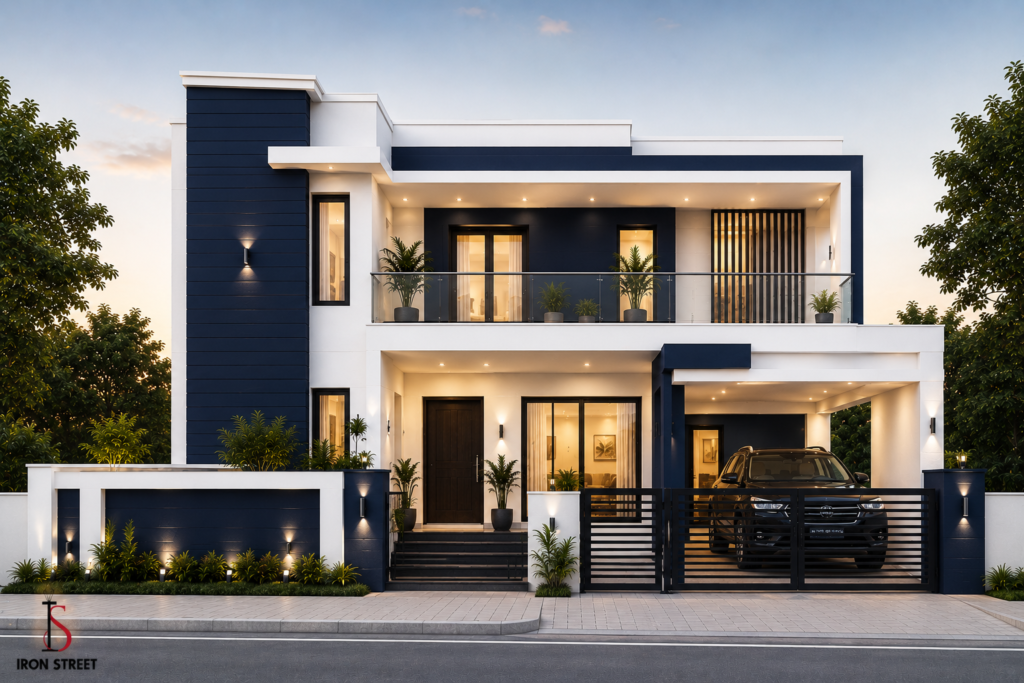
If you want to make a bold, confident statement, a high-contrast navy blue and white combination is an excellent option. Navy blue is a powerful, regal color that instantly draws attention, while crisp white keeps the overall design from feeling too heavy or closed off.
- Where to apply: Highly recommended for homes with clean, distinct architectural elevations. Use navy blue on a singular, prominent accent wall or the front projecting facade, and wrap the rest of the building in a bright, clean white.
- Why it works in 2026: It feels fresh, nautical, and modern. It gives standard concrete structures an upscale, crisp look that stands out sharply in any suburban setting.
6. Light Grey & Wooden Texture Finish
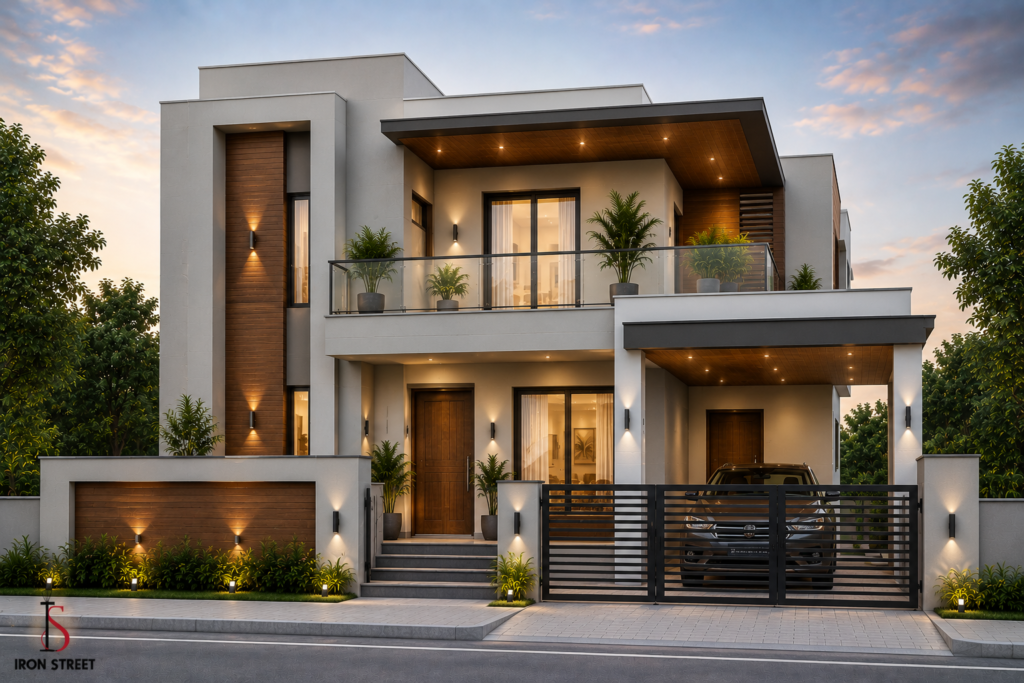
This combination takes its cues from high-end Scandinavian and industrial architecture. Instead of relying solely on two paint colors, this trend pairs a smooth, flat light grey paint finish with the organic, warm grain of natural or faux wood panels (such as wood-finish tiles or ACP sheets).
- Where to apply: Ideal for luxury duplexes and homes with large glass windows. Use light grey as the expansive canvas across the property, and use wooden cladding to highlight the main entrance, cantilevered blocks, or balcony ceilings.
- Why it works in 2026: The stark contrast between the cool, urban grey paint and the warm, texturized wood element creates a multi-dimensional look that screams luxury.
7. Olive Green & Sand Beige
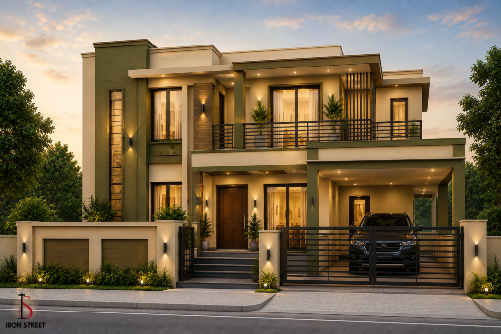
An incredibly grounded, earthy palette that feels both modern and deeply connected to nature. Olive green brings a rich, subdued undercurrent of color, while sand beige keeps the building bright and approachable.
- Where to apply: Perfect for farmhouse designs, sprawling independent houses, or homes located in semi-urban and rural areas. Use sand beige for the primary structure to maintain high light reflectivity, and use olive green on exterior staircases, window borders, and structural pillars.
- Why it works in 2026: This combination is incredibly forgiving against mud splatters, dust storms, and rainwater streaks, making it one of the most functional yet stylish choices of the year.
How to Choose the Right Colour Combination for House Exterior Walls
Before looking at the color swatches, it helps to establish a systematic selection process. Avoiding a chaotic or mismatched look requires filtering your choices through a few structural lenses.
1. Understanding Home Architecture Style
Your home’s architectural blueprint should dictate its color direction.
- Modern and Minimalist Homes: These rely heavily on sharp lines, geometric shapes, and deep recesses. They are best paired with neutral bases (like greys and off-whites) contrasted against sharp accents (like charcoal or black metallic finishes).
- Traditional Indian Homes: Characterized by sloping tiled roofs, grand pillars, arched windows, and intricate carvings, these structures benefit from warmer, earthier palettes—such as terracotta, cream, beige, and soft yellow.
2. Climate and Sunlight Considerations
Sunlight alters how color behaves. Intense, direct sunlight fades bright, saturated pigments over time.
- High-Sunlight Zones: If your home faces south or west and receives harsh sunlight all day, avoid overly vibrant or incredibly dark primary walls. Dark colors absorb heat, increasing cooling costs inside. Opt for light, light-reflective bases with dark colors reserved strictly for small architectural accents.
- Heavy Rainfall Zones: Humid and coastal zones are highly prone to fungal and algal growth. Mid-toned earthy shades or cool greys are excellent choices here because they conceal minor water staining far better than bright whites or delicate pastels.
3. Matching Exterior Colours with Surroundings
Your home does not exist in a vacuum. Look at your neighborhood. If your house is surrounded by lush green trees and landscaping, organic shades like sage greens, beiges, and warm terracottas will look beautiful. If your house sits in a dense urban concrete setting, clean neutrals and structured greys help your property stand out without clashing against adjacent buildings.
4. Choosing Low-Maintenance Colors
If you do not want to wash your exterior walls every few months, prioritize dust-friendly colors. Dusty environments make beige, sand, taupe, and light brownish-grey your best friends. These tones share the same base hue as common road dust and soil, meaning your home will look clean and freshly painted for much longer.
Trending Outside Paint Colours for House Exteriors in 2026
If you look at recent upscale architectural designs, a few distinct color shifts stand out this year.
Neutral Exterior Shades
Neutrals are no longer just plain white or basic cream. In 2026, “complex neutrals” dominate the market. Homeowners are opting for greiges (a beautiful blend of grey and beige), taupes, and mushroom shades. These colors adapt fluidly to changing daylight, looking cool and crisp in the morning and warm and cozy under evening lights.
Earth-Tone Combinations
Driven by a desire for calm, organic living environments, earth tones are seeing a massive resurgence. Think rich clays, muted sage, deep forest moss, and warm sand tones. These colors don’t just look beautiful; they also age incredibly gracefully against environmental dust and rain.
Matte Finish Exterior Paints
High-gloss exteriors are out. Matte and ultra-matte finishes are heavily favored for modern outside walls. A matte finish absorbs light rather than reflecting it harshly, which helps hide minor plastering flaws, uneven wall surfaces, and subtle dings or cracks.
Two-Tone Exterior Wall Trends
The current trend is a 70-30 or 60-30-10 color rule. Instead of painting the whole house one color, designers choose a dominant color for 60% to 70% of the surface area, a secondary contrasting color for 30%, and an occasional third accent color (often found on the main door or metal fixtures) for a crisp 10% pop.
Common Exterior Color Combination Mistakes to Avoid:
Painting your house exterior is an expensive, labor-intensive project that you won’t want to redo for at least another 5 to 8 years. Avoid these common traps:
- Using Too Many Dark Colours: Painting an entire house in deep charcoal or dark blue can trap heat inside your home and cause the paint to chalk or fade much faster under intense UV exposure.
- Ignoring Sunlight Exposure: A color that looks like a beautiful, muted pastel inside a dimly lit paint shop can look blindingly bright and washed-out when applied to an exterior wall under direct noon sunlight.
- Choosing Trendy Colours Without Testing: Never buy paint in bulk based solely on a digital catalog or a photo you found online. Always buy small sample pots first and test them directly on your walls.
- Poor Contrast Selection: If your base color and accent color are too close in tone (e.g., light grey and medium grey), your house can end up looking flat, washed out, and muddy from a distance. Ensure there is enough contrast to let the architectural details shine.
Tips to Make House Exterior Walls Look Premium:
You don’t need an astronomical budget to give your home a high-end, designer feel. A few clever styling tricks can instantly elevate standard exterior paint.
Texture Paint Ideas
Instead of keeping all your walls perfectly smooth, introduce a textured finish to a prominent focal wall, such as the lift shaft wall, a central column, or the entrance facade. Popular exterior textures like rustic grit, concrete wash, or scratched plaster finishes add immediate architectural depth and luxury.
Accent Wall Combinations
Identify the architectural highlight of your front elevation—whether that is a towering stone-clad wall, a modern cantilevered balcony, or a grand porch entrance. Paint this specific zone in your secondary bold color (like navy blue, olive green, or terracotta) to create an instant focal point that anchors the rest of the property.
Gate and Boundary Wall Matching
Your boundary wall and main gate are the first elements anyone actually interacts with. Do not leave them as an afterthought. Ensure your compound wall mirrors the exact color ratio of your main house. If your house is warm white and charcoal grey, paint your boundary walls warm white and install a sleek, charcoal grey metal gate for a cohesive look.
Lighting Impact on Exterior Colors
Great paint needs great lighting. Yellow warm spotlights (3000K to 4000K) casting upwards against a textured exterior wall can make even simple beige or grey paint look breathtakingly premium at night. Avoid harsh white floodlights, which can flatten your home’s architectural dimensions.
Quick Comparison Table of Popular Exterior Colour Combinations
| Colour Combination | Best Architecture Style | Maintenance Level | Visual Vibe / Impact | Heat Absorption |
| Warm White & Charcoal | Modern Duplex / Urban | Medium | Sleek, Minimalist, Luxury | Low to Medium |
| Beige & Coffee Brown | Traditional / Contemporary | Very Low | Warm, Inviting, Grounded | Medium |
| Sage Green & Off-White | Villas / Bungalows | Low | Organic, Serene, Elite | Low |
| Terracotta & Cream | Traditional Indian / Classic | Low | Cultural, Rich, Welcoming | Low |
| Navy Blue & White | Modern Elevation / Coastal | Medium | Bold, Crisp, Energetic | Medium to High |
| Light Grey & Wood Finish | Luxury Modern / Industrial | Low | High-End, Architectural | Low |
| Olive Green & Sand Beige | Farmhouses / Independent | Very Low | Natural, Earthy, Subdued | Low |
How to Test Exterior Colour Combinations Before Painting
To eliminate any anxiety about making the wrong color choice, use this reliable three-step testing method before handing over a deposit to your painters.
1. Sample Patch Testing
Never skip this step. Purchase small 1-liter sample cans of your final chosen base and accent colors. Paint a large 2ft x 2ft square patch directly onto your home’s exterior walls. Make sure to paint this sample patch across two distinct areas: one wall that faces direct sunlight and another that sits constantly in the shade.
2. Digital Visualization Tools
Almost every major paint manufacturer now provides excellent, free digital visualization apps or website tools. You simply upload a clear daylight photograph of your home’s current exterior, select your color codes, and digitally preview how different shades will look on your walls. While it isn’t 100% accurate to real-world paint pigments, it will give you a fantastic baseline idea of how well your base and accent colors contrast with one another.
3. Daylight and Night Appearance Checking
Once your physical sample patches are dry on the wall, inspect them at three different times of the day:
- At 8:00 AM: Check if the morning light makes the colors look too bright or pastel.
- At 1:00 PM: Check if the harsh noon sun completely washes out the tones or creates an uncomfortable glare.
- At 6:00 PM: Check how the color shifts under sunset tones and your outdoor evening artificial lighting.
If you still love the color patches across all three lighting conditions, you have found your perfect exterior palette.
Conclusion:
Choosing the perfect color combinations for house exterior walls is all about balancing your personal style with the practical realities of your home’s architecture, climate, and surroundings. In 2026, the trend leans heavily toward thoughtful choices, whether that means choosing a sleek warm white and charcoal gray for an urban duplex or embracing rich earth-toned sage green and terracotta shades for a timeless independent home.
Along with exterior colors, modern homeowners are also paying closer attention to outdoor decor elements like railings, gates, lighting, and premium metal furniture online to create a more complete and visually balanced exterior design. The right outdoor furniture and metal accents can significantly enhance the overall curb appeal while maintaining a modern architectural aesthetic.
You May Also Like:
1. 10 Trending Bedroom Wall Colour Combinations
2.. Bedroom Bed Decoration Guide: 2026
Frequently Asked Questions (FAQs)
Q1. Which exterior wall colour combination is best for Indian homes?
The combination of beige & coffee brown or terracotta & cream is widely considered the best for traditional and contemporary Indian homes. They reflect harsh sunlight efficiently, match beautifully with regional landscapes, and are exceptionally good at hiding ambient road dust and monsoon water stains. For ultra-modern Indian duplexes, Warm White & Charcoal Grey is the reigning favorite.
Q2. What are the trending outside paint colors for house exteriors in 2026?
The year 2026 is dominated by complex neutrals (greige, taupe, mushroom), organic earth tones (sage green, olive green, sand beige), and crisp two-tone contrasting palettes executed in ultra-matte finishes rather than high-gloss paints.
Q3. Which exterior paint colors require less maintenance?
Mid-toned, earthy shades like sand beige, biscuit cream, muted taupe, sage green, and light grey require the least maintenance. Because these shades closely match the color of natural dirt and atmospheric dust, they keep a home looking clean far longer than stark white or deep, dark paints.
Q4. Are dark exterior colors good for small houses?
No, dark exterior colors are generally not recommended as the primary base for small houses. Dark colors absorb light and make walls look closer together, which can cause a compact home to feel small and imposing. Small houses should stick to light, bright bases like ivory, cream, or light pearl grey, using dark colors strictly as subtle accent trims.
Q5. How do I choose modern exterior house paint colors?
To choose a modern color scheme, identify your home’s architectural highlights and follow the 70-30 rule: pick a clean, light neutral base (like light grey or off-white) for 70% of the building, and pair it with a sharp, high-contrast dark tone (like charcoal or navy blue) for the remaining 30% on recessed areas, pillars, or accent panels. Always test your top picks with physical wall patches before committing to a final purchase.